Visual Design Elements: Shapes
Visual Design Elements:
Shapes
Shapes are one of the fundamental visual design elements of photography. Learn how to use shapes effectively to convey emotion and meaning in your photographic compositions.
Labeling
Before we dive into a discussion about picture composition and shapes, let’s talk about how we see the world.
When you see a flower, your brain rushes to label it. “Flower!” it exclaims loudly and proudly. This voice that labels objects around us is essential in a world where we are constantly bombarded by visual stimuli. Without this labeling and categorizing mechanism, we would become overwhelmed with information. However, the brain’s labeling system works against the photographer. Once we identify and label an object, we often don’t look any further. When that happens, we miss out on really seeing.
“Tree,” says our brain. And then the object is dismissed without noticing the graceful curve of the branch, or the way the wind is blowing through the leaves, or the silhouette that it forms against the skyline – all potential photographic opportunities.
Close-up photography can train you to see…
When photographing subjects close up, images often become abstract, since you are seeing only a portion of the subject. This takes away your brain’s ability to easily label, and all of a sudden, you are able to really see. Your attention is now guided to the visual design elements of the subject: the lines, shapes, textures, and patterns, which are the fundamental building blocks of all images. I believe that close-up photography can help you to hone this skill, and that practice at close-up shooting will improve the rest of your photography too.
Learning to turn off labeling when you look at the world around you helps you abstract what you see. Instead of seeing flowers and trees and fields, you can see shapes: rectangles, and triangles, and circles. Once you can do that, you’re on the road to creating better, and more thoughtful photography composition.
Shapes
Tip
Remember your geometry lessons from school? Equilateral triangles have all 3 sides the same length.
Isosceles triangles have 2 sides the same length.
The primary shapes are squares, circles and equilateral or isosceles triangles. Secondary shapes are variations on those, i.e., rectangles, ovals, skewed triangles, as well as more complex shapes like stars.
Appropriate use of shapes in your image can lend it a sense of structure and organization. It is best to use a small number of different shapes in a single image (one, or at most two). In other words, use only triangles, or only rectangles, rather than having a mix of circles, triangles, and squares all in the same image. With a mix, the result can be chaotic.
If you choose a primary shape for your image, it tends to give it a sense of stability and regularity. The secondary shapes lend a more dynamic feel to the picture. Choose your shapes to reflect the message you want to convey. For example, moving your camera position over to one side might change the perspective so that a field becomes more rectangular in shape, rather than square.
Let’s look at a few examples of photography composition, and see if you can identify the shapes in them.
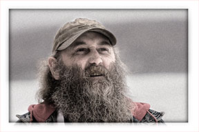
What shape do you see in the image?
© Julie Waterhouse Photography

Hint: this image is the same composition, only upside-down.
© Julie Waterhouse Photography
The above images contain simple triangles. The triangle formed by the lily is slightly skewed, giving it a slightly less static feel than if the triangle had been perfectly centered with sides of equal length. Here are the same images with the triangles traced out:
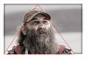
© Julie Waterhouse Photography
© Julie Waterhouse Photography
How about the following image? What shapes do you see?

© Julie Waterhouse Photography
There are more triangles in the picture above. This time, the arrangement of visual design elements is a little more complex, with more triangles than the previous portrait or lily. However, all the triangles meet at a point in the center, giving stability and balance to the image; appropriate given that the subject relates to the finality of death. The bottom triangle in incomplete, and the corners are implied. Your brain is easily able to fill in the missing part. There is, of course, another triangle formed by the shape of the road.
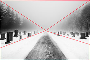
© Julie Waterhouse Photography
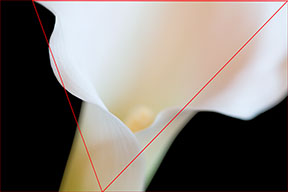
In the following picture, there are again many triangles. Can you see them?

© Julie Waterhouse Photography
However, in this case, they are skewed, not regular. Once again, some of the shapes are incomplete, but our brain fills in the remainder. This image has a very different feel than the last one. It is much more dynamic, and we are drawn down the hill into the picture.
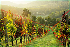
© Julie Waterhouse Photography
Notice how, in all of these images, the edges of the frame form one edge of the shape. It’s very important exactly where you place those edges! Read more about framing your images in the section on cropping photos, which is a topic closely related to visual design elements.
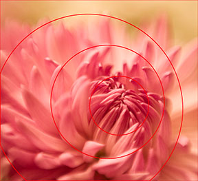
Enough of triangles! What shape do you see here?

© Julie Waterhouse Photography
That’s right! Circles! The fact that the circles are not concentric (i.e., each circle is slightly off-center from the next) prevents the image from becoming too static.
© Julie Waterhouse Photography
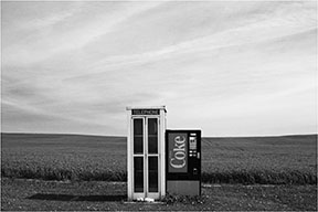
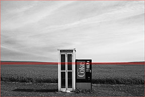
Let’s have one more shape. What’s left?
© Julie Waterhouse Photography
I see two large rectangles divided by the horizon line. The silhouettes of the phone booth and the Coke machine are also rectangular, echoing the main shapes.
© Julie Waterhouse Photography
In terms of its visual design elements, this image has a strong horizontal line, and a central subject placement, giving it a "solid" feel. I used this picture composition to emphasize the fact that the phone booth and Coke machine were seemingly set down in the middle of nowhere. The static nature of the image is given slight relief by the horizon line being vertically off-center, the shadow of the phone booth being only to one side, and the phone booth and Coke machine being different heights.
Check out our helpful, informative eBook
for in-depth tips on composition
and visual design!
Next, I recommend you read about another of the visual design elements: texture.