This section is packed with examples of photograph composition along with exercises to test whether you’ve grasped the concepts from our composition section. Check your skills in seeing, choosing, arranging and framing picture elements.
© Julie Waterhouse Photography
Answers to all questions follow the exercises, and are linked from within each exercise. Sometimes, there’s no right or wrong! Your opinion may differ.
Exercise #1
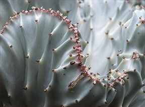
© Julie Waterhouse Photography
- 1. What is the most prominent design element in this image?
- 2. Does it say:
- (a) strong and confident?
- (b) sensual?
- (c) dynamic change?
For a hint, review this visual design elements section.
Find the answer.
Exercise #2
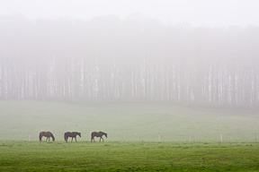
© Julie Waterhouse Photography
- 1. In this image, what classic photography rule of composition does the placement of the horses follow?
- 2. Besides their position within the frame, why else is your eye drawn to the horses?
- 3. Do you think it is okay to have only a little dark green grass and a lot of light area in the image? Why or why not?
For a hint for #1, review this section on subject placement
For a hint for #2 and #3, review this photograph composition section.
Find the answer.
Exercise #3
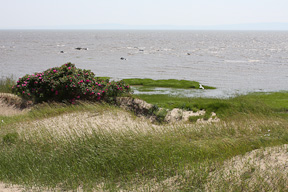
© Julie Waterhouse Photography
- 1. How could this composition be improved?
For a hint, review this section.
Find the answer.
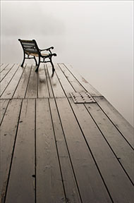
Exercise #4

© Julie Waterhouse Photography
- 1. Does this photograph composition have any distractions?
- 2. How do you feel about the overall balance of the image, once any distractions are removed?
- 3. What is one element of the photograph composition that does work, in terms of subject placement?
For a hint for #1, review this section on distractions.
For a hint for #2, review this section on balance.
For a hint for #3, review this section on subject placement
Find the answer.
Exercise #5

© Julie Waterhouse Photography
- 1. What visual design element is most prominent in this image?
- 2. What feel does the element in (1) give to the image?
- (a) stable?
- (b) highly dynamic?
For a hint, review this section on visual design elements.
Find the answer.
Exercise #6
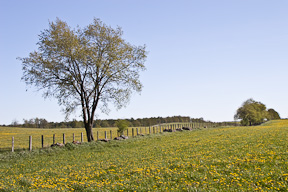
© Julie Waterhouse Photography
- 1. What rule is employed in this photograph composition?
- Note: there are (at least 🙂 two reasonable answers here.
For a hint, review this rule or this one.
Find the answer.
I hope you found these exercises helpful!
The answers start here.
Answer to Exercise #1
© Julie Waterhouse Photography
1. The most prominent visual design element is the red line on the cactus. It is an S-curve that leads your eye through the image.
2. (b) It gives a sensual mood to the image.
Go to Exercise #2.
Answer to Exercise #2
© Julie Waterhouse Photography
1. The horses are placed (approximately) according to the photography Rule of Thirds.
2. Your eyes are drawn to the horses because they are very dark in relation to their surroundings. This contrast gives them a lot of visual weight.
3. The strip of vibrant green grass at the bottom balances the upper light rectangle. Although smaller in size, its strong color gives it a lot of visual weight.
Go to Exercise #3.
Answer to Exercise #3
© Julie Waterhouse Photography
1. The blank sky adds nothing to the image. It would benefit from cropping, as follows. After the crop, you see that the picture space is now divided into a horizontal strip of water that takes up a third of the vertical space, and a strip of land that takes up two thirds of the vertical space. The image is now following the photography Rule of Thirds.
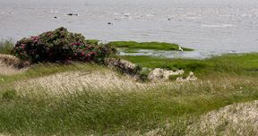
© Julie Waterhouse Photography
Go to Exercise #4.
Answer to Exercise #4
© Julie Waterhouse Photography
1. The black sections in the bottom left corner carry a lot of visual weight and are distracting. Your eye is pulled to them, away from the main subject.
2. Once the black is removed, I find that there’s too much white on the left side of the image that keeps pulling my eye over. It overwhelms the yellow because of it’s brightness, and leaves the image unbalanced.
3. The one thing the image has right is the placement of the lily stamen in the top right thirds position. Even if the image is cropped to remove the excess white, this placement in the thirds position is preserved.
The following crop addresses the problems of (1) and (2), while preserving the rule of thirds in (3).

© Julie Waterhouse Photography
Go to Exercise #5.
Answer to Exercise #5
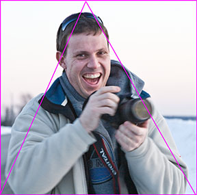
© Julie Waterhouse Photography
1. The strongest visual design element in this photograph composition is a triangle.
2. (a) The shape of the triangle is quite regular – it’s almost an equilateral triangle. That gives the image stability.
Go to Exercise #6.
Answer to Exercise #6
© Julie Waterhouse Photography
1. The first possible answer is that the photo uses the "Major-Minor" rule. The tree on the left is echoed by the small tree on the right hand side.
The second possible answer is that the image uses the concept of visual weight to balance it. The large tree on the left is balanced by the smaller trees on the right. Although they are not equal in size to the large tree on the left, the smaller trees on the right carry enough visual weight to balance the larger one. They are more dense, making them a dark spot against the sky. They are also close to the edge of the frame.
A third (!) possible answer is that the photograph composition employs the rule of thirds, since the land takes up about one third of the vertical picture space, and the sky takes up about two thirds. The "head" of the large tree also sits roughly in the thirds position.