Photography Critique #2
Learn photography through a friendly and constructive photography critique. In this video, I share my thoughts on a lovely image of water under a pier, offering tips for simplifying the image to focus on a single story.

Spread the joy! Share today’s tweetable!
Video Summary
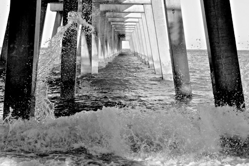
Kimberly Pettit has been kind enough to share her image for evaluation. Thank you so, much, Kimberly! And here it is:

© Kimberly Pettit
Photography Critique: What I like about this image!
You’ve got me right away with the subject of this photo. I love water, I love photographing water, and I love looking at photos of water!
Here, I also love the light. The reflections that it has created on the water below the pier are gorgeous. Related to the light, I love the colors in the image. I appreciate the contrast of the complimentary colors. There are warm hues under the pier, contrasting with cool blues around the outside. That works well.
Finally, I love the repeated shapes of the pier footings that lead our eyes in to a vanishing point.
All of these elements are very strong, and I can see why Kimberly was drawn to this scene.
Photography Critique: A Quick Fix
The first thing I notice is that the horizon is not quite level. A small rotation takes case of that quickly.
Photography Critique: The Weakness in the Image
I think the weakness of the image is that it is a bit too busy. It feels to me like there’s a lot going on, and I’m not sure where I should be looking. I’d like to see the image simplified a little.
Photography Critique: Tip to Determine How to Simplify
Whenever feel the need to simplify an image, I do a quick test. I switch the image to black and white, and review it. Sometimes, it’s the color that’s overwhelming the photo, and serving as a distraction, rather than supporting the story. In such cases, a conversion to black and white might simplify the photo and strengthen the story.
© Kimberly Pettit
Change to B&W by Julie
In this case, the image still feels overwhelming to be in black and white. I don’t feel that solved the issue, which points to the fact that it’s the composition, and the lines and shapes in the image that are making it feel too busy to me. It’s time to switch back to color, and try something else!
Photography Critique: Cropping to simplify and strengthen composition
There are two strong elements in the image: the splash across the front and up the left side, and the repeating pattern of the pier footings. The elements don’t seem to be working together here, but instead are competing for my attention.
My first attempt at a crop will be to try and simplify the image, while keeping both of these elements:

© Kimberly Pettit
Crop by Julie
To me, this crop just reinforces the fact that these two elements are competing. It hasn’t solved the problem. I like the splash at the left, and I like the repeating shapes, but my attention bounces between them. Time to try again.
I feel like I need to make a choice between the splash and the pier. To me, the pier is the strongest element, with the repeating shapes, and the beautiful light underneath, so I’d like to keep that. This time, I’ll crop in from the bottom left.

© Kimberly Pettit
Crop by Julie
I kept a little of the dark beam on the left to balance the one on the right, and a little splash at the bottom to serve as an anchor and a bit of a frame. I much prefer this crop. I feel like we’ve simplified the image, and settled on a single story to tell.
There’s one more experiment to try! It’s often worth flipping your image horizontally to see which way works best. Our eyes "read" images from left to right, just the way (in this culture) we read books. Let’s try it:

© Kimberly Pettit
Crop and flip by Julie
This looks even stronger to me. I feel like my eye is grabbed at the left, and sent through the image, following the lines and led to the vanishing point.
Note that this crop is quite different from the original image. In the original, the vanishing point was closer to the center. This crop is asymmetrical. I prefer it this way, since the imbalance adds to the angles of the lines to move us through the image. If you prefer symmetry, however, there is another option for cropping to a square that puts the vanishing point in the center, and emphasizes symmetry:

© Kimberly Pettit
Crop and flip by Julie
I prefer to stick with the asymmetric version! For a final touch, I’d warm up the color temperature just a little to saturate those warm hues even more.
© Kimberly Pettit
Original

© Kimberly Pettit
Edits by Julie
Thanks once again to Kimberly Pettit for sharing her image with us for a photography critique!
I hope you enjoyed this photography critique! Be sure to check out more beginner photography critique videos, as well as our Two Minute Photo tips videos on digital photography technique.
Return to Beginner Photography (Photography Critique Index)