Lesson 3:Composition
All photos and text © Julie Waterhouse, all rights reserved worldwide. No form of reproduction or usage (including copying in whole or in part, or altering of digital image and text files) is permitted without the express written permission of Julie Waterhouse.
Composition is one of the most important aspects of a great photograph. What you include in the image (and what you don’t), and how you arrange the elements within the frame, contribute significantly to the overall success of the image. Will it have impact? Will it convey your message? There’s no right or wrong, but the elements included, and the perspective taken, should serve to strengthen the story being told — your story. The same general principles of composition apply to close-up photography as to any other kind of photography.
Here are a few tips to help you choose a composition that reinforces what you’re trying to say.
Colour and Tone:
When we refer to “colour” we are usually referring to the hue – red, or green, or brown, for example. “Tone” refers to the degree of brightness.
Colour and tone can express emotion. As you might expect, light tones tend to lift the spirits, while dark tones are perceived as "moody." Red is a color of passion. Blue – well, we’ve all heard the expression about "feeling blue." Use color and tone to reflect the mood you are trying to create in your image.
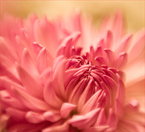
Compare the feeling you get from the following two images. The one on the left has a warm hue; the one on the right has a cool hue.

© Julie Waterhouse Photography

© Julie Waterhouse Photography
Lines:
A line in an image may be an actual object, like a road or the stem of a plant, or even the human form. It may also be the boundary between two different colours or tones in the image. Like colour and tone, lines also express emotion.
Vertical lines are uplifting, strong, and powerful.
This flower is standing tall and proud.
© Julie Waterhouse Photography
Diagonal lines imply motion, action or change. They are dynamic.

The diagonal lines give this image energy.
© Julie Waterhouse Photography
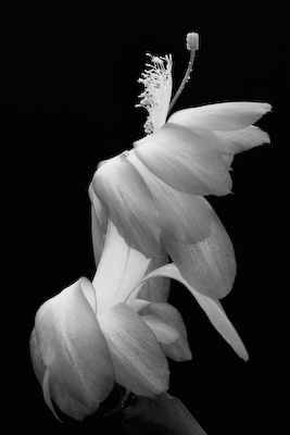
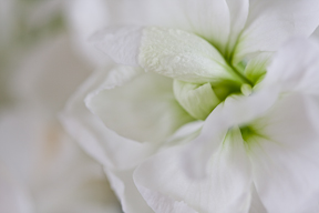
Curved lines are slow and meandering. They say "take your time, and don’t rush." They can be sensual. They can also appear melancholy or hopeful, depending on the direction of the curve. Note how we attribute human characteristics to objects when their lines reflect our own body language.

The S-curve of this cactus has a sensual feel.
© Julie Waterhouse Photography
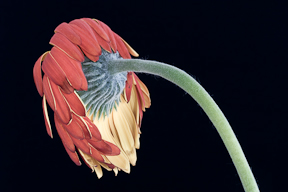
The curve of this daisy makes it look sad.
© Julie Waterhouse Photography
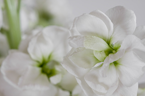
Horizontal lines are steady and calm. They imply tranquility or stability.
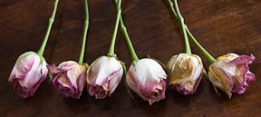
The horizontal rose heads form a solid row.
© Julie Waterhouse Photography
Whatever the statement you want to make with your image, consider positioning the main line of your subject to reinforce the appropriate feeling. You may even find that you are subconsciously drawn to subject matter whose lines "align" with your mood!
Some Rules of Composition:
How you assemble your picture elements together determines whether the final image "works" or not. In fact, the rules of composition are not hard and fast rules; rather, they are guidelines that you can use to combine your picture elements so that you tell your story most effectively. Here are a few rules for you:
Simplify
How many novice vacation photographs have you seen where the photographer had obviously been so excited by the vista in front of them, that they had tried to include absolutely everything in the frame "to give you an idea of what it was like there." The result is usually a chaotic and overwhelming jumble.
You might think that close-up photography could not possibly suffer from this problem, since you are dealing with the photography of a very tiny area. Of course you can’t stuff "too much" into the image! After all, you’re only photographing a couple of square inches. Well, I have news for you. You can put too much into a close-up image just as easily as you can put too much into an image of a sweeping vista. You need to think of close-up photography as shooting "landscapes," only on a miniature scale.
A chaotic image.
© Julie Waterhouse Photography
This image has a bit too much going on! It might be hard to save. Recomposing might help bring order to the chaos, but right now, we have too many shapes, and the image lacks structure and organisation.
Many close-up images are spoiled because they are too busy. Less is more! It’s just as important what you leave out of an image as what you include in it. Keep your image clutter free, and include only those elements that contribute to the story or enhance your message.
Remember that you are trying to communicate.
1. Photography is comprised of a creative side, which involves the artistic expression of ideas, as well as a technical side, which encompasses the skills that the practitioner requires to execute a well-exposed and carefully composed image.
2. Photography is both an art and a craft.
Which of those two sentences is easier to understand? When you write or speak, you aim for clarity in your language. Do the same visually!
How to simplify
Selective focus.
© Julie Waterhouse Photography
1. A shallow depth of field is an excellent tool for simplifying your image. Selective focus through the use of a wide aperture can draw attention to the key element in the image, while lessening the impact of the elements that are rendered in soft focus.
A shallow depth of field is also a great way to eliminate a cluttered background.
There’s too much going on in this image.
© Julie Waterhouse Photography
2. Getting closer to your subject in order to hone in on what’s really important is another great way to simplify your image. Getting closer will reduce the amount of subject matter in the frame. You can eliminate elements that don’t contribute to the story; if they don’t contribute, then they detract.
Get in closer to simplify.
© Julie Waterhouse Photography
In the image above, the second flower on the left and the strong green stem on the left both compete for attention with the flower on the right. Getting closer in to focus only on the right-hand flower makes for a simpler story.
3. If you are already as close as you can or want to get to your subject, then you can change your composition to eliminate unwanted elements by moving your camera. Sometimes a small change of angle or a shift in direction can make all the difference in the world.

Tulips with distractions.
© Julie Waterhouse Photography

A cleaner image results from shifting the camera angle.
© Julie Waterhouse Photography
4. Consider simplifying the number of colours in your image as well. For example, including the tonal variations of a single colour often works better than including multiple colours.

A lot of colours may be over-whelming.
© Julie Waterhouse Photography
Fewer colours makes a simpler image.
© Julie Waterhouse Photography
The Classic Rule of Thirds
The rule of thirds is probably the most often referenced rule of composition. It is all about subject placement within the frame.
First of all, imagine that your picture space is divided into thirds both horizontally and vertically, like a tic tac toe grid.
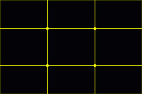
Rule of Thirds grid
© Julie Waterhouse Photography
The rule of thirds tells us to align our subject with one of the points where those lines cross. That means our subject is one third of the way “into” the picture space – from either the top or bottom, and from either the left or right. And that means it’s not in the middle. Too often, novice photographers fall victim to what I call "bullseye syndrome," and instinctively place their subject in the dead centre of the image (there’s a reason it’s called the "dead" centre! — it’s dull and uninteresting!). This seems especially true when people are photographing flowers.
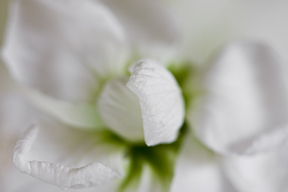
Central placement is static.
© Julie Waterhouse Photography
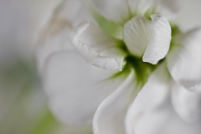
Off-centre placement of the subject is more dynamic.
© Julie Waterhouse Photography
Note: All rules are meant to be broken. The lessons here are meant to make you think about why you are placing the subject where you are, and not just to blindly follow the rules. Central placement of objects is considered "dull" because it’s very static. There’s no tension if an object is in the "middle" — it’s not being pulled more to one side than the other. But if your message is about stability, constancy, and equilibrium, then central placement might be exactly the right thing to do. Use your judgment, and learn when to override the rules!
Horizontal or Vertical Framing?
Most novice photographers tend to always shoot with their camera held horizontally, producing pictures in landscape format. Sometimes it’s better to hold the camera vertically, and shoot in portrait format. How do you know when to use which format? The bottom line is that the frame should compliment the form. In other words, when positioning your camera, match the orientation of the frame to the orientation of the subject.

Horizontal framing.
© Julie Waterhouse Photography

Vertical framing.
© Julie Waterhouse Photography
Either one of the images above of lily stamens can "work." Which do you prefer? I think the vertical one has more impact. Since the stamens themselves are vertically-oriented, the vertical framing emphasises their natural lines. The stamens seem "crowded" in the horizontal image.
Since close-up photography often results in abstract images, there isn’t always an obvious "up" and "down" in the picture space. Take advantage of this flexibility to turn your camera to achieve the best placement of shapes and lines.
Hints and Tips
Technique 1: Because the subjects are so small in close-up photography, I find it difficult to pre-visualise my composition by looking directly at the subject. I find it much easier to find my initial composition by looking through the viewfinder. I tend to go "exploring" with my lens. I have it mounted on the tripod, but loosen all controls so that I have the flexibility to move the camera in any direction. While looking through the lens, I move the camera around until something catches my eye. I then begin to lock down the camera movement, and make small refinements to the camera position to achieve exactly the composition I want.
Technique 2: I really "work" my subject. I can spend hours making compositions of the same flower or bunch of flowers. Don’t settle for the first composition you find! There are many in there to be had. Keep experimenting, and you may stumble upon something magical. That’s not (just!) luck — it’s a result of your persistence.
Assignment #3:
1. Lines. Make a close-up image where your composition includes a strong line.
a. Tell me in words what the orientation of the lines is (horizontal, vertical, diagonal, or curved), and how you feel this affects the mood of the image.
2. Rule of Thirds. Make a close-up image where you make use of the rule of thirds.
3. Horizontal or Vertical Framing. Make a pair of close-up images of the same subject. In one, orient your camera horizontally. In the other, orient it vertically.
a. Briefly tell me in words which one you like better and why.
Upload one (1) image for question #1, one (1) image for question #2, and two (2) images for question #3, using the instructions you received in your welcome email. Include the text to answer questions #1a and #3a in the "message" section when you upload the images. You will upload four (4) images in total. Remember to name your image files in such a way that it’s clear which question they address.
Happy shooting!
All photos and text © Julie Waterhouse, all rights reserved worldwide. No form of reproduction or usage (including copying in whole or in part, or altering of digital image and text files) is permitted without the express written permission of Julie Waterhouse