Visual Design Elements: Perspective
Visual Design Elements:
Perspective
Perspective is one of the visual design elements. It indicates depth in a two-dimensional image. Learn how to use perspective to communicate with your viewers — or to keep them guessing!
Perspective
Photography is a two-dimensional medium. Perspective is the tool we use to indicate depth. We can decrease or magnify the sense of perspective by how we arrange our other design elements (lines, shapes and textures). If we arrange them in a way that reflects the "real" three dimensional world, then we can easily communicate in a familiar language.
Maximizing Perspective
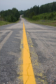
The trick to conveying the greatest sense of depth in an image is to use a wide angle lens, oriented vertically, and held close to an element of the foreground, as in the images below.
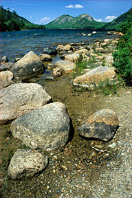 © Julie Waterhouse Photography |
 © Julie Waterhouse Photography |
On the other hand, long lenses tend to "flatten" perspective, and reduce the feeling of distance in a photography composition.
We may, however, deliberately choose to arrange our visual design elements in such a way as to remove the usual perspective cues, and force the viewer to take a closer look at the image. They may be able to "figure it out," or you may intend the image to remain an abstract design.
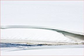
It’s hard to get a sense of scale from this image.
Is it a close-up of only a few inches, or is a huge iceberg?
Closer inspection of the water gives it away. It’s a length of about 10 feet.
© Julie Waterhouse Photography
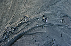
This image has even less depth cues. It could be an aerial
photo of a large area, or a close-up on only a few inches.
© Julie Waterhouse Photography
Neither approach is right or wrong; it’s all about what message you want to communicate. Use the building blocks of visual design elements as tools.
Depth Cues
Relative size
How large objects are in relationship to each other gives us an indication of their distance away. If there are two objects that we know to be the same size in real life, and yet one appears much smaller than the other in the image, we assume the smaller one to be further away. Think of two people in a photo. One appears large, and the other tiny. We don’t jump to the conclusion that the tiny one has been magically shrunk! Instead, we simply assume that person is standing further away.
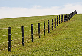
Fence posts get smaller as the fence recedes.
© Julie Waterhouse Photography
In the image above, the fence posts are all the same size in reality. In the picture composition, they are smaller on the right than on the left. This cues us that the right side of the fence is further away.
Color
In general warmer colors (e.g., reds, oranges, yellows) seem to advance, and cooler colors (e.g., blues, purples) tend to recede.
Lighter toned objects tend to seem closer than darker toned objects. One exception to this is due to the effect of atmosphere. Haze tends to lighten objects in the distance, as in the photography composition below.
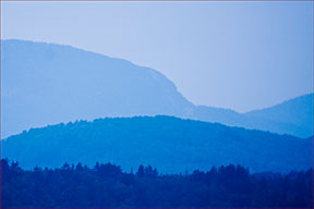
Atmospheric haze makes the distant hills lighter.
© Julie Waterhouse Photography
Sharpness
Tip
When choosing the focal point in your image, the viewer’s eye will more readily accept that objects further away are out-of-focus. The things closest to the camera typically need to be sharp.
We use focus as a cue for distance. This is related to the atmospheric effect defined above. In addition to making distant objects appear lighter, the haze also makes lines and edges softer, and less "focused." As a result, we tend to interpret sharper, in-focus objects as being closer to us than softer, out of focus ones.
Texture
We talked about texture as one of the visual design elements in the last section. Texture also cues us to distance. The closer a texture is to us, we more we can discern it, and the more coarse-grained it is. As it gets further away, the individual elements of the texture get smaller and closer together, and the whole texture appears finer-grained. The following image of a canola field illustrates this principle. We know that the canola near the top of the frame is further away from us than the canola at the bottom of the frame because of the cues provided by the texture.
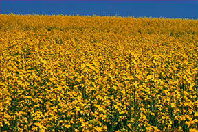
The texture gets more fine-grained as the canola recedes into the distance.
© Julie Waterhouse Photography
Overlapping Objects
One more cue for perceiving depth is the overlapping of objects. This is quite straightforward. When an object overlaps another, we perceive it to be in front. In the photography composition below, the sequoia (the red tree) blocks the view of the pines because it is in front of them – and therefore closer to us.
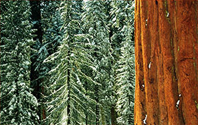
The overlap cues us that the sequoia is in front.
© Julie Waterhouse Photography
Point of View
Perspective can also refer to your point of view. Get creative! Take an unusual perspective when you photograph. Shoot from down low to take on your pet’s view of the world. Or shoot from high above to see like a bird, as in the following image of a Florentine cafe.
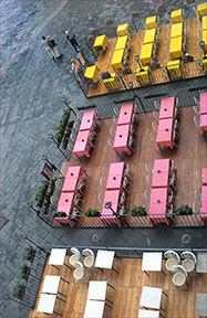
A bird’s eye view.
© Julie Waterhouse Photography
We’ve finished with perspective photography, the last of the visual design elements!
Check out our helpful, informative eBook
for in-depth tips on composition
and visual design!
Next, you may want to read about the first of the photography rules of composition: simplify!