Visual Design Elements: Light
Visual Design Elements:
Light
The visual design elements of photography include light, line, shape, texture and perspective. Use the lines and shapes created by contrasts of light to create an effective picture composition.
Light
Light is a photographer’s raw material.
Light produces two kinds of contrast that make the other design elements of line and shape visible in photography composition. The two kinds of contrast are contrast in color, and contrast in brightness. Differences in color and brightness are what
form the basic building blocks of an image. In other words, the boundary between a light and a dark area, or between a red and a green area, creates a line, or the edge of a shape.
- Color: Color refers to the different hues in an image: red, green, brown, purple, etc.
- Brightness: Brightness, or tone, refers to the degree of lightness in an image. We usually separate a photograph into areas of light tones, mid tones and dark tones.
In a black and white photograph, you have only one color, so you must rely on differences in tone to create shape boundaries between objects. In a color photograph, you have an additional tool to create boundaries.
Consider that your photography composition is comprised of a red tree amongst a group of green ones, as in the following photographs. Both the red and green trees have the same degree of brightness, so in the black and white version, the red tree simply gets lost, and merges into the green trees.
If, however, you photograph the scene in color, the red tree stands out easily because the contrast in color creates a visual boundary between it and the surrounding green trees.
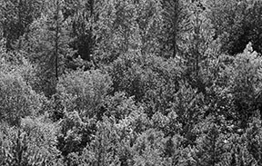
No tonal contrast. The red tree gets lost among the green
and the photograph loses all of its impact.
© Julie Waterhouse Photography
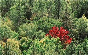
Color contrast separates the red tree from the green ones.
© Julie Waterhouse Photography
It is important to note that color and tone can also express emotion. Light tones tend to lift the spirits, while dark tones are perceived as moody. Red is a color of passion. Blue – well, we’ve all heard the expression about "feeling blue." Use color and tone to reflect the mood you are trying to create in your image.
The angle of the incident light also has an effect on the picture composition. Back or side light highlights details, and may reveal textures or lines in the image. Light from high above (like the sun at midday) causes unpleasant, harsh shadows, and is usually to be avoided.
Check out our helpful, informative eBook
for in-depth tips on composition
and visual design!
Next, I recommend you read about another visual design element: lines.