Are you confused, or maybe even a little intimidated by the photo histogram? In the first video of this three part series, I explain how to understand and interpret the data in your camera’s histogram display.

Spread the joy! Share today’s tweetable!
If you want to know more about histograms, and see more histogram examples, check out what is a histogram, interpreting the digital photography histogram, and histogram examples.
Video Transcript
Are you confused or even a little intimidated by the histogram display on your camera? You are not alone! Hi, I’m Julie from Ultimate Photo Tips, and I’m going to do a little mini-series as part of the Two Minute Photo Tips, all about histograms, and today is part 1 or 3. I want to take the mystery out of this super-important feature on your camera.
What is a histogram? Your photo histogram is a graph that shows the distribution of all the brightness levels in your image. In other words, it shows how much of you image is bright, how much is dark, and how much of it falls into the mid-tones. Let’s look at what a histogram looks like.
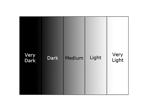
First of all, this is the graph without any image information. The left-most edge represents pure black, and the right-most edge represents pure white. All the shades of gray are represented in between. Let’s look at some actual image examples to make things more clear.
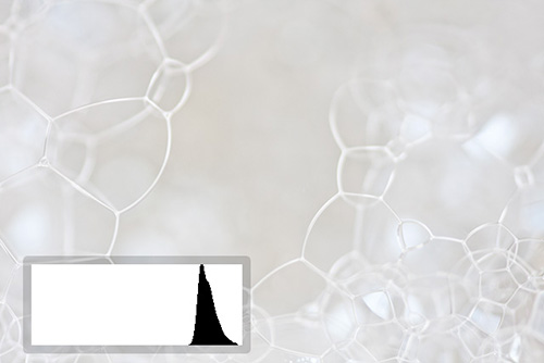
The first image I’m showing is of bubbles. It’s a high key image full of light tones. Now, think for a second; what would you expect the corresponding photo histogram to look like? Here it is. It’s a bump on the right hand side of the graph. Now if you had a low key image full of dark tones, you’d expect a bump on the left hand side of the graph instead.
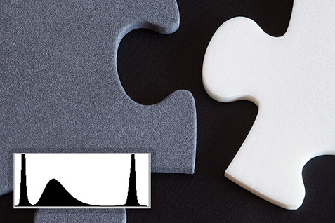
Here’s an image that has three distinct areas of tone: an area of dark, and area of mid-tone, and an area of light tone. The photo histogram looks just as you’d expect. Here we have three bumps in the graph. The left one corresponds to the very dark area, the middle bump corresponds to the grey puzzle piece, and the right bump corresponds to the white puzzle piece.
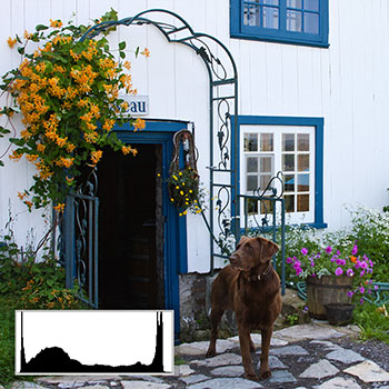
Here’s a more typical image, where you have a full range of tones. The histogram for this one has a spike at the left that represents the dark tones in the doorway. It has a larger spike at the right that represents the white wall. Finally, it shows lesser amounts of data throughout the rest of the tonal range, corresponding to the other tones found in the image.
Now, you might be wondering what you do with all this great information that you’re getting from your histogram. Next week, I’ll be doing part two in this series on histograms. In that video, I’ll cover how you can use the information from your histograms to correct your exposure.
For more information about histograms and more examples, make sure you check out the other histogram pages on ultimate-photo-tips.com, linked below this video.
Happy shooting and I’ll see you next time!